Scroll to explore

Overview
Industry
Beverage
Scope
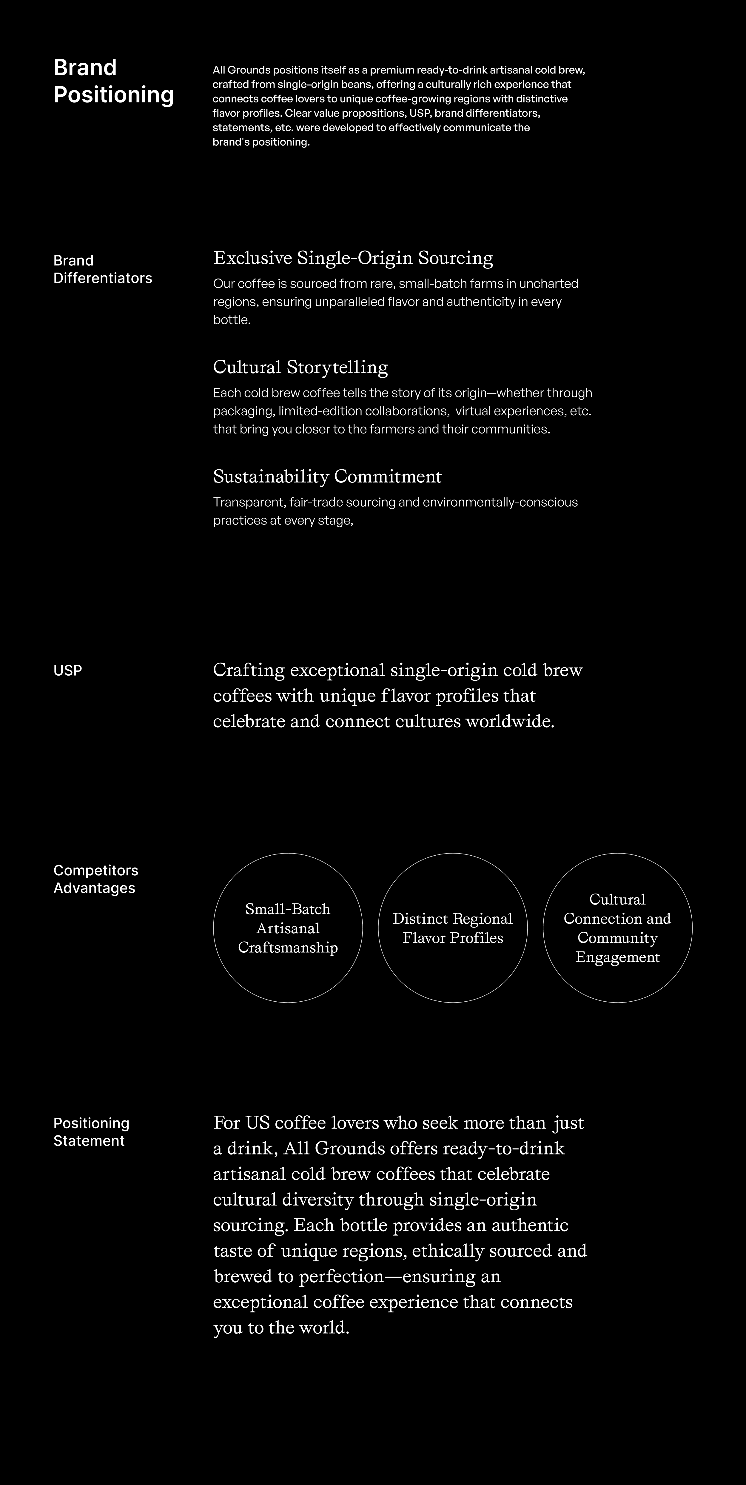
Branding, Naming & Packaging
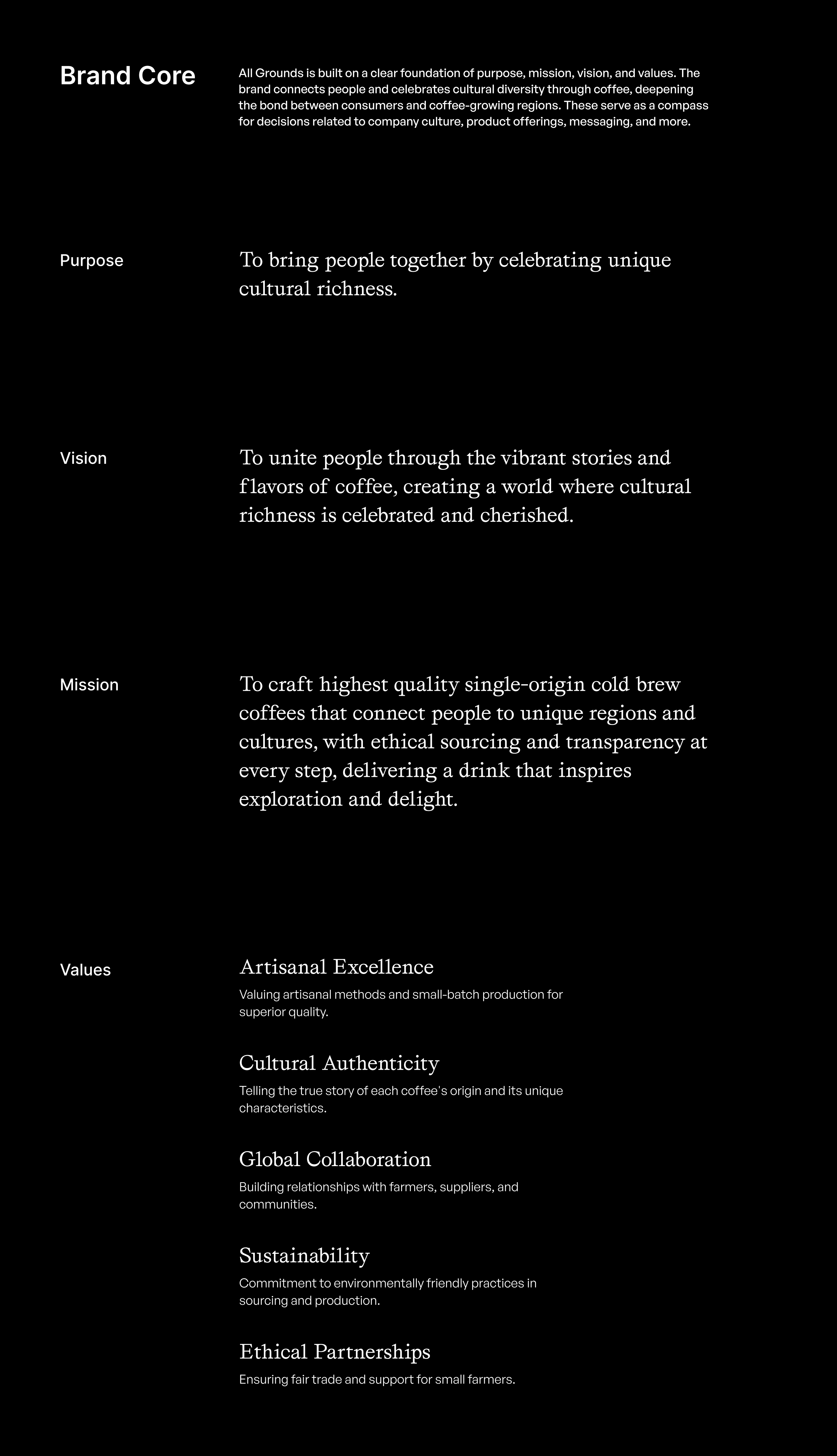
Brand
All Grounds Coffee
All Grounds
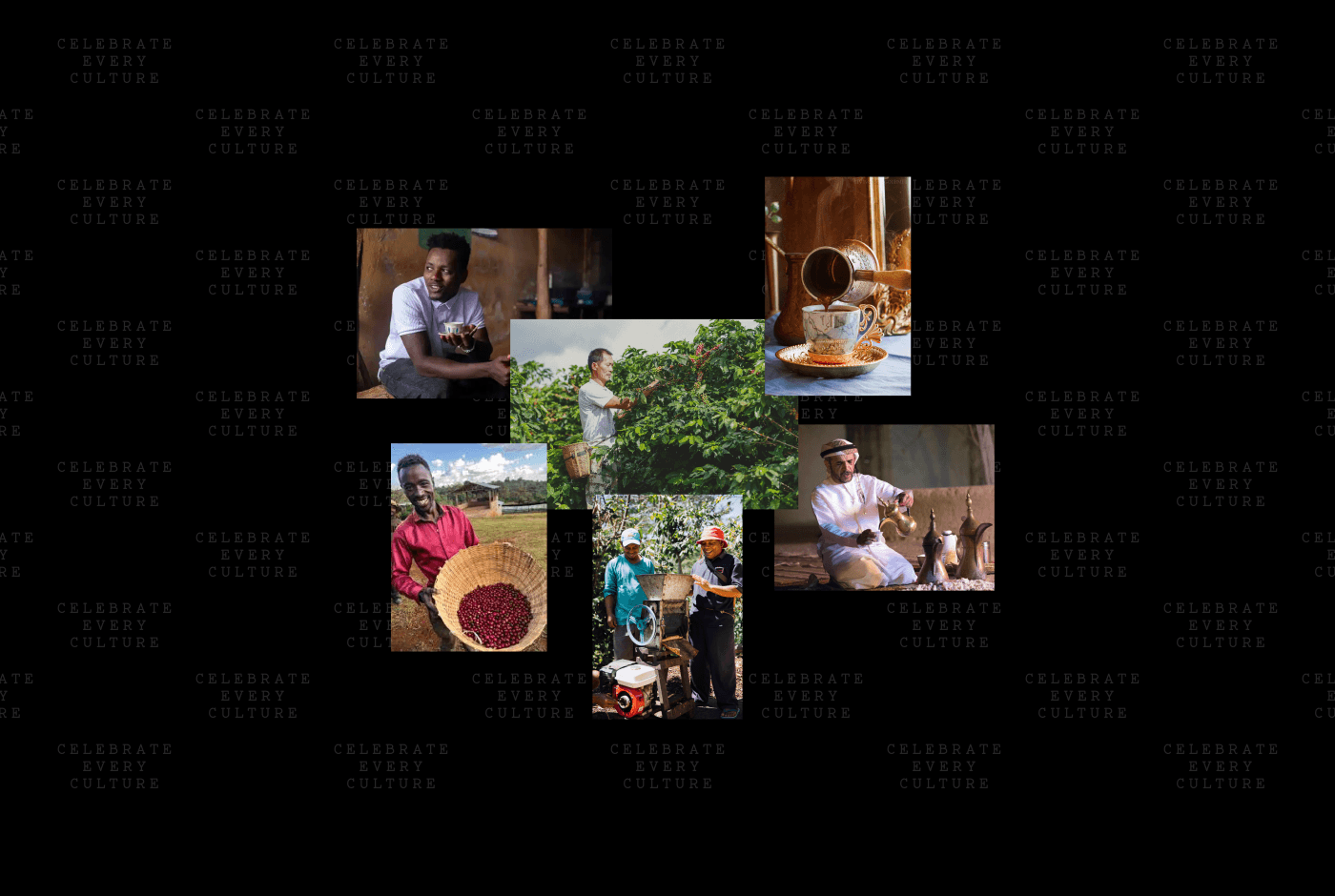
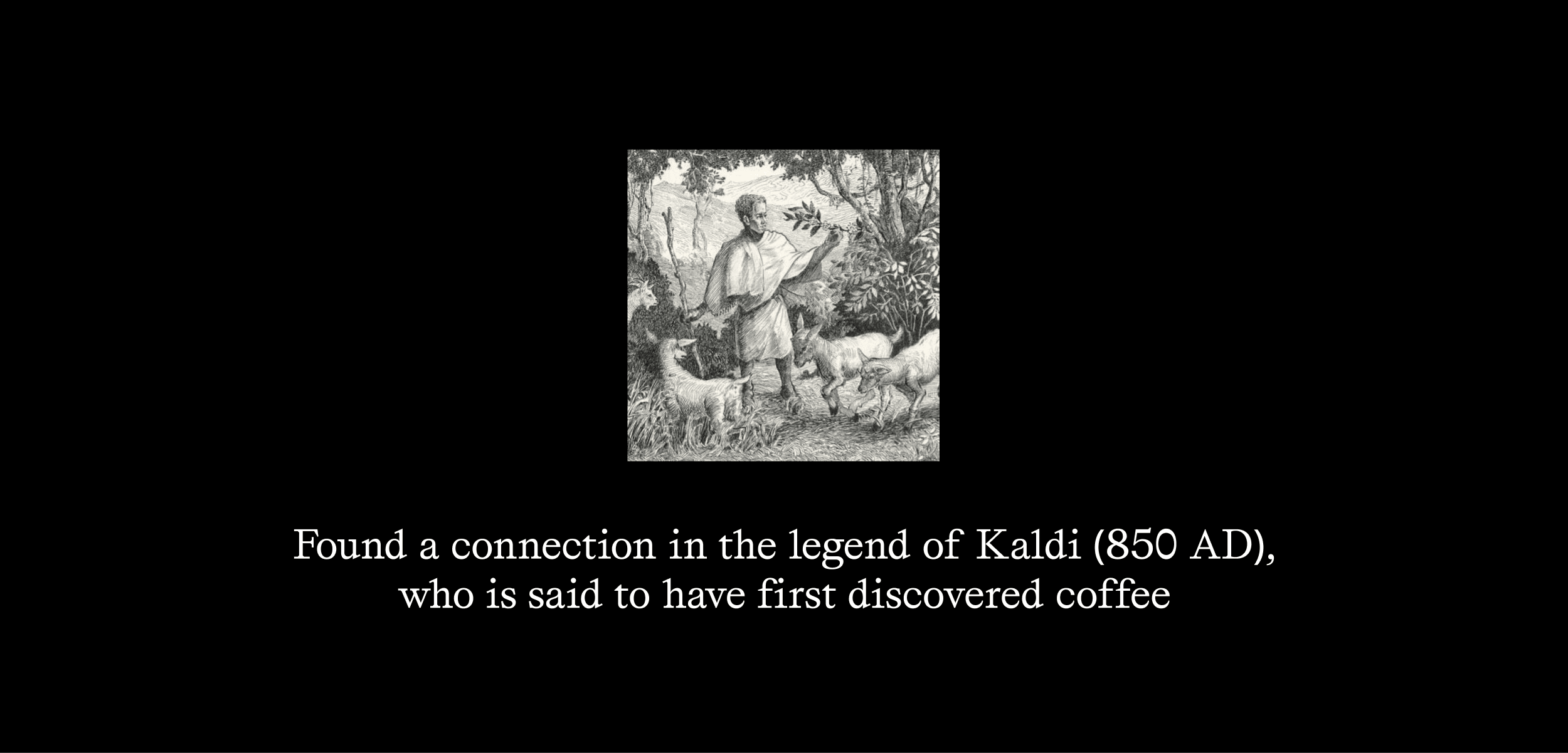
Connecting Cultures Through Coffee
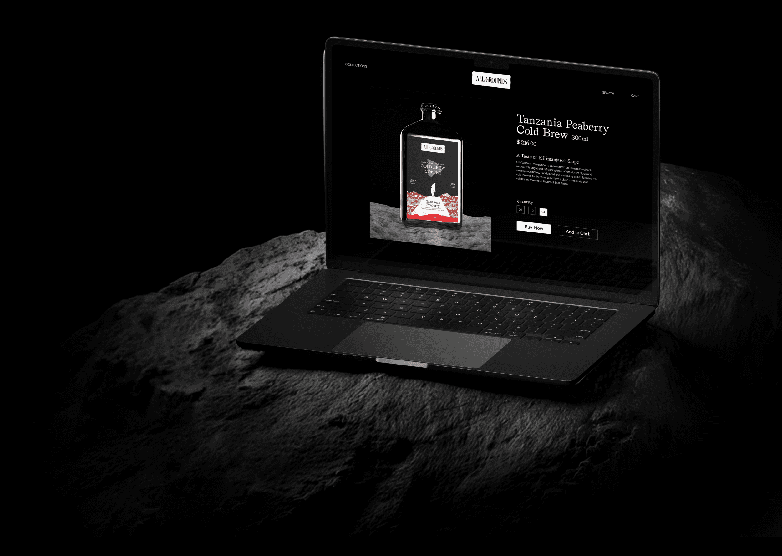
All Grounds is a specialty ready-to-drink (RTD) cold brew coffee brand created for people who appreciate exceptional quality and distinctive flavors. Using single-origin beans sourced from carefully selected farms around the world—including Tanzania, Hawaii, and Sumatra—the brand offers more than just coffee; it delivers a journey through the cultures, landscapes, and stories behind every origin.
Challenge
In an increasingly crowded coffee market dominated by familiar yet mass-produced options, All Grounds needed to establish itself as a premium and differentiated choice.
The key challenges included:
Positioning the brand in a highly competitive category by highlighting its unique strengths: single-origin sourcing, cultural storytelling, and artisanal craftsmanship.
Creating a memorable brand foundation—from naming and strategy to personality and visual identity—that reflects the quality of the product and the richness of its origins.
Designing packaging that stands out in retail environments, appeals to a sophisticated audience, and effectively communicates the brand’s story, values, and premium positioning.
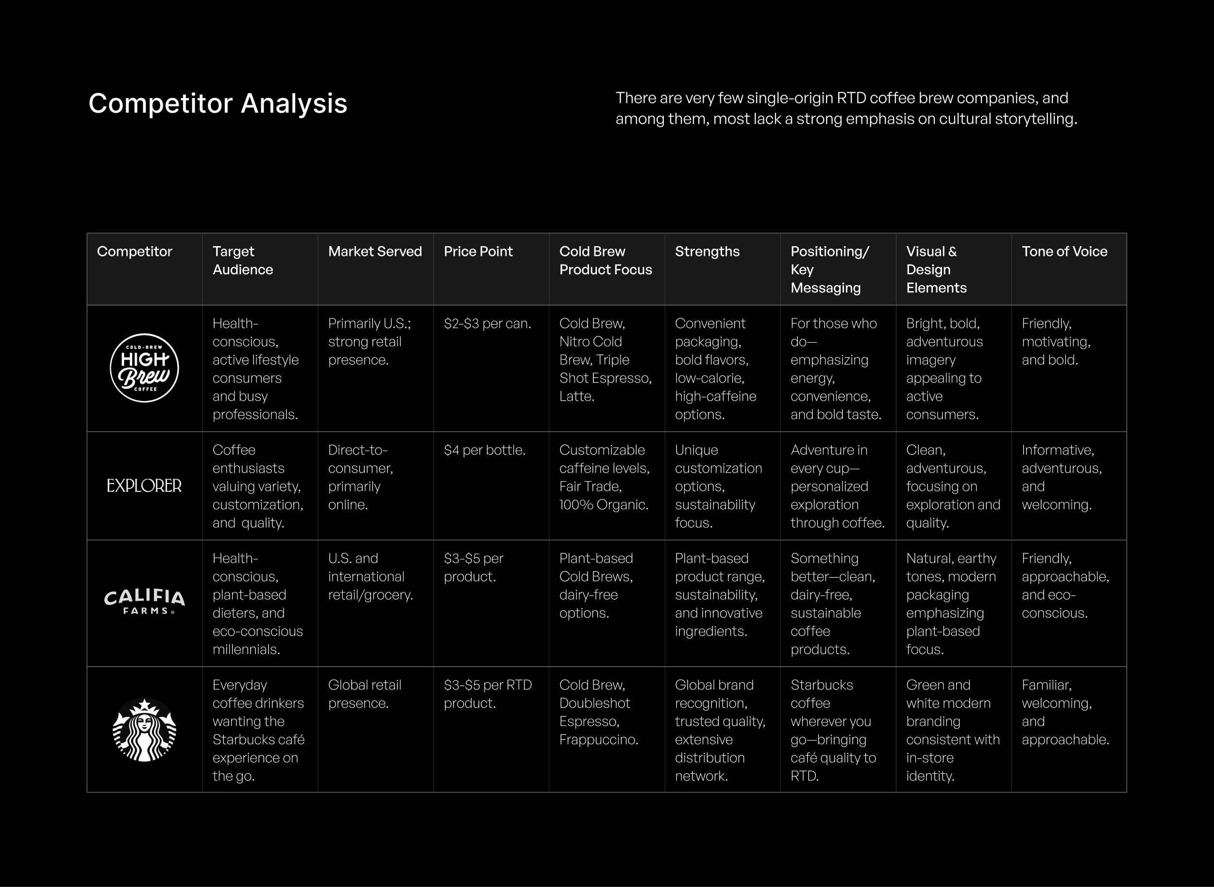
Research & Analysis
To position All Grounds effectively within the premium RTD coffee market, Rezon Studio conducted an in-depth analysis of the cold brew category. We examined competitor positioning, brand strategies, pricing structures, messaging, visual identities, and brand personalities to uncover opportunities for meaningful differentiation.
The research helped define a clear target audience and develop detailed user personas, providing a strong strategic foundation for the brand. These insights informed every aspect of the project—from messaging and positioning to design and product strategy—ensuring the brand resonated with the right consumers while standing apart in a crowded market.
Several opportunities emerged from the analysis, but the most significant findings were:
Direct Competitors: A small number of brands dominate the premium RTD cold brew segment, primarily competing on quality, flavor profiles, and sourcing credentials.
Market Gap: While many brands emphasize taste, craftsmanship, and bean origins, few explore the cultural stories, traditions, and communities behind the coffee itself.
This revealed a valuable opportunity for All Grounds to occupy a distinct position in the market—one that celebrates the cultural richness of coffee alongside its commitment to quality, sustainability, and craftsmanship.
By connecting consumers to the people, places, and traditions behind every origin, All Grounds could transform a functional coffee purchase into a more meaningful and memorable experience.
Scope of Work: Competitor Analysis, Target Audience Identification, User Persona Development, User Needs Mapping, Market Opportunity Identification, Brand Positioning Strategy.
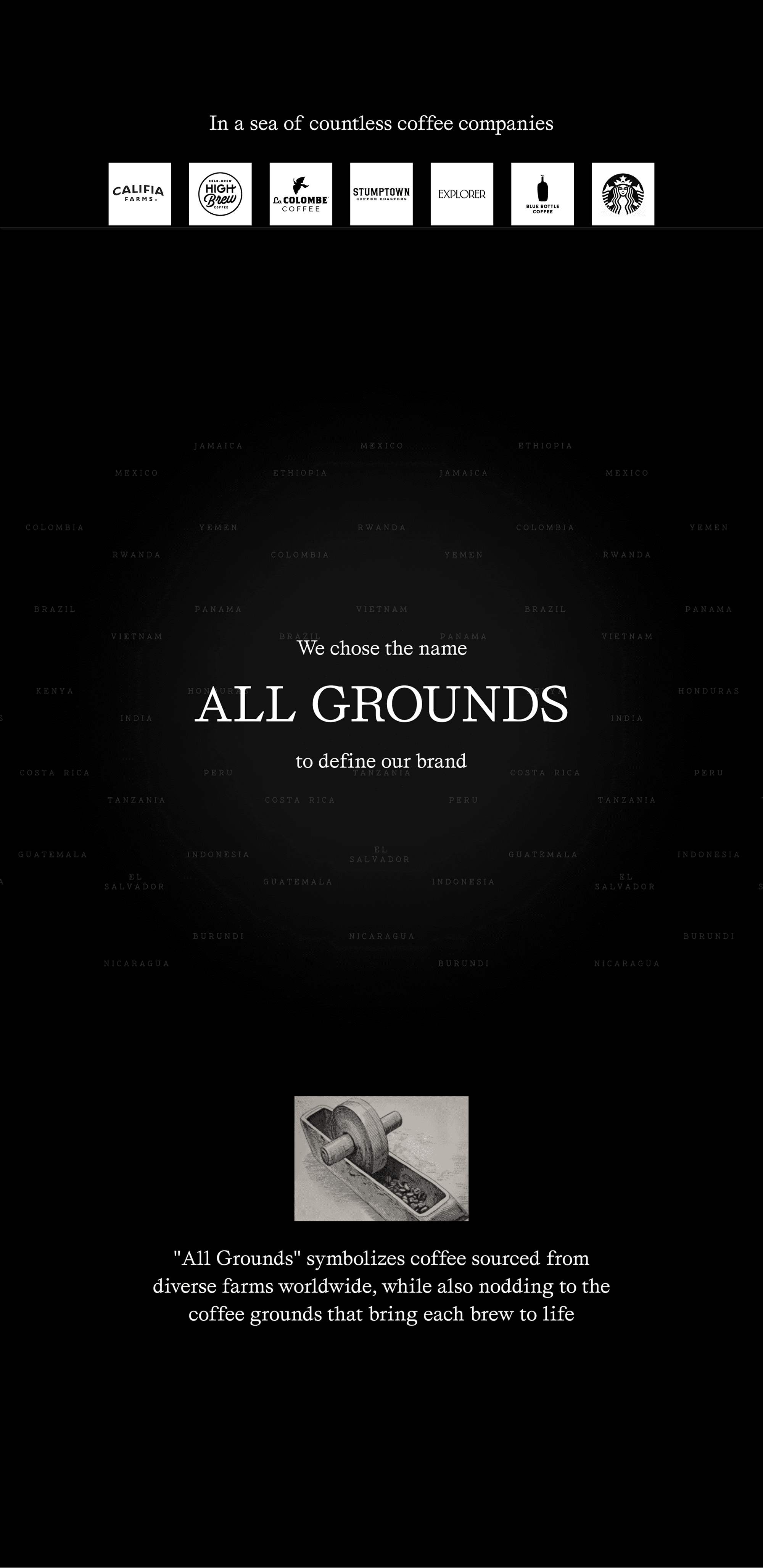
Brand Naming
The name All Grounds was strategically developed to reflect the brand’s mission of connecting people to coffee cultures from around the world.
“All” represents inclusivity, connection, and the diverse communities, traditions, and origins that shape the global coffee experience.
“Grounds” carries a dual meaning—referring both to the coffee grounds used in the brewing process and the geographical grounds where the beans are grown and sourced.
Together, the name captures the essence of the brand: a celebration of global coffee origins, cultural exploration, and exceptional craftsmanship. It serves as a powerful foundation for the brand’s storytelling, reinforcing the idea that every bottle brings together people, places, and flavors from across the world.
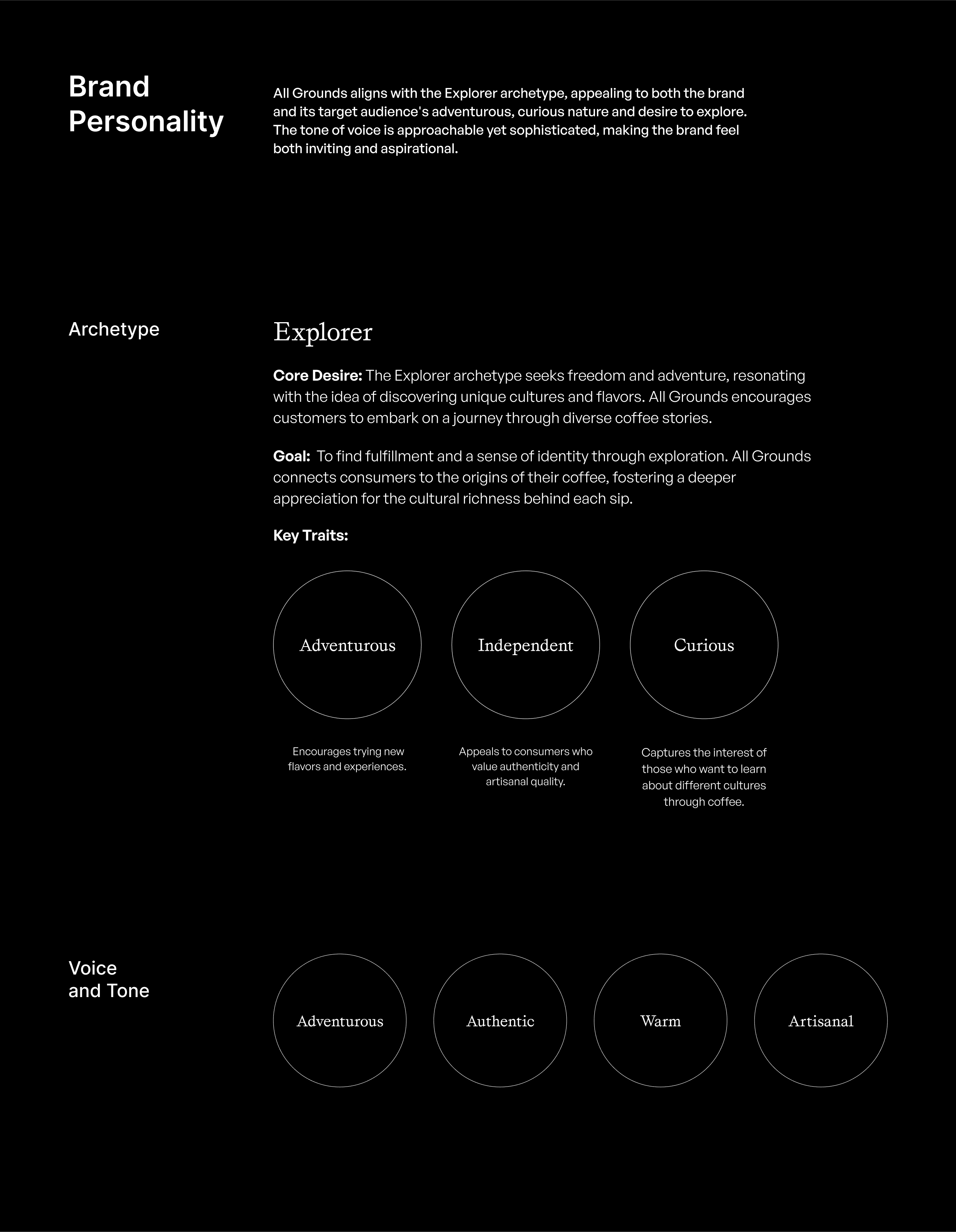
Brand Strategy
The strategy behind All Grounds was built around creating a premium cold brew coffee brand that goes beyond taste and quality to foster meaningful cultural connections. By offering ethically sourced, single-origin coffees from around the world, the brand transforms every product into an opportunity for discovery, storytelling, and exploration.
Developed through extensive research, strategic thinking, and creative development, the brand strategy began with a deep understanding of the target audience, market dynamics, and competitive landscape. This process helped uncover a unique positioning opportunity within the premium ready-to-drink coffee market—one that celebrates the people, places, and cultures behind every coffee origin rather than focusing solely on flavor and sourcing credentials.
The result is a brand that combines exceptional craftsmanship, cultural storytelling, and sustainability into a cohesive experience that resonates with modern consumers seeking authenticity, quality, and deeper meaning in the products they choose.
Scope of Work: Purpose, Mission Statement, Vision Statement, Internal Values, External Values, Brand Differentiators, Value Propositions, Unique Selling Proposition (USP), Positioning Statement, Brand Archetype, Brand Personality, Voice & Tone Guidelines, Key Messaging Framework, Brand Narrative, Brand Story, Elevator Pitch.
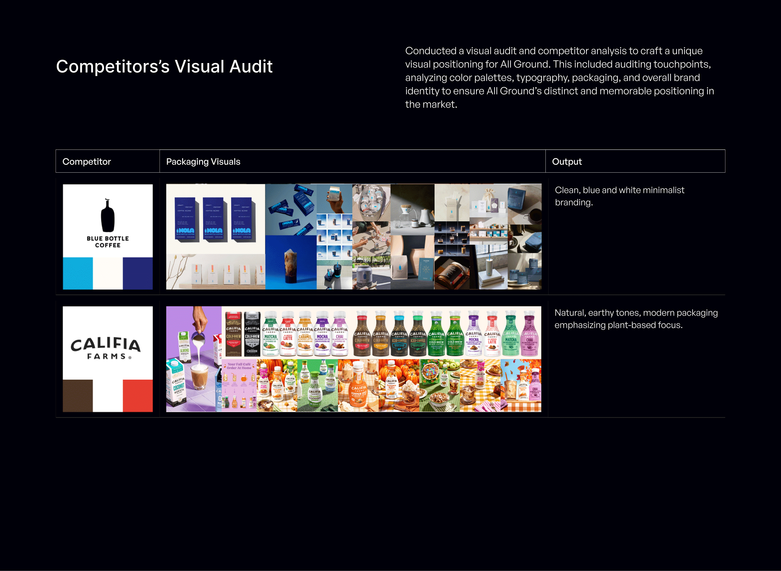
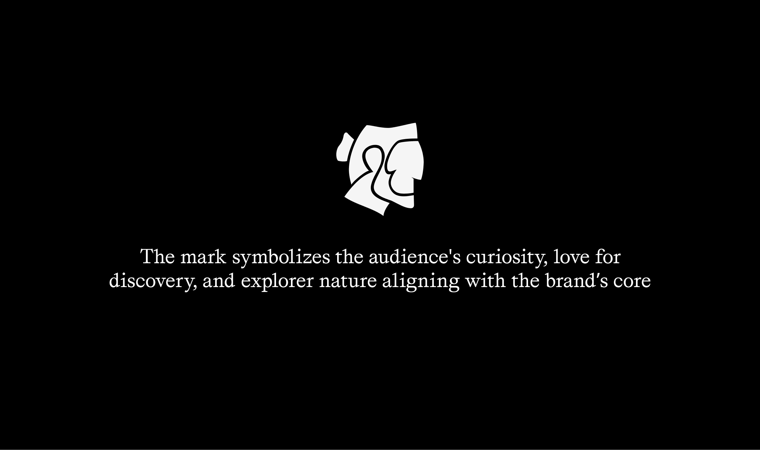
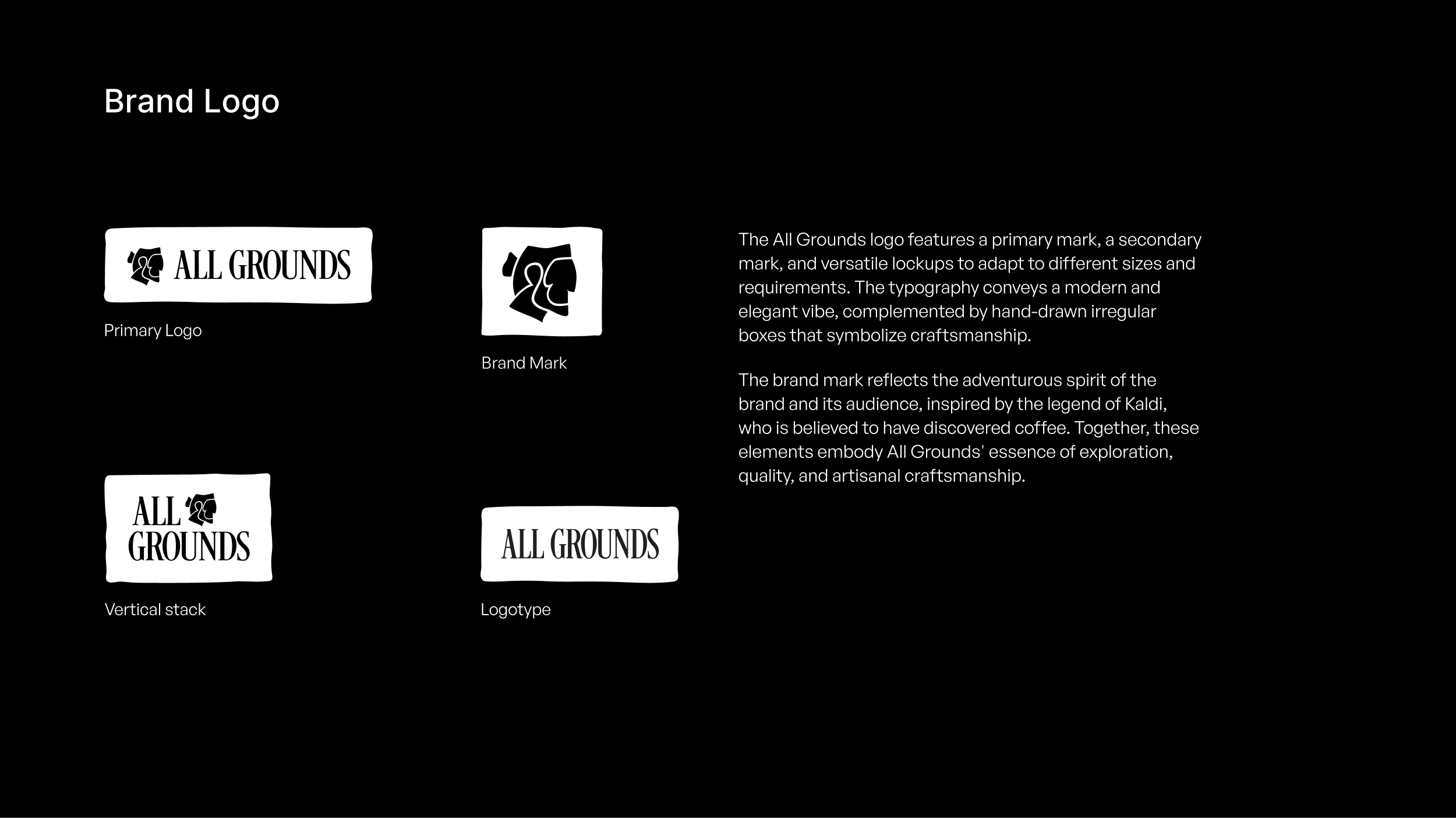
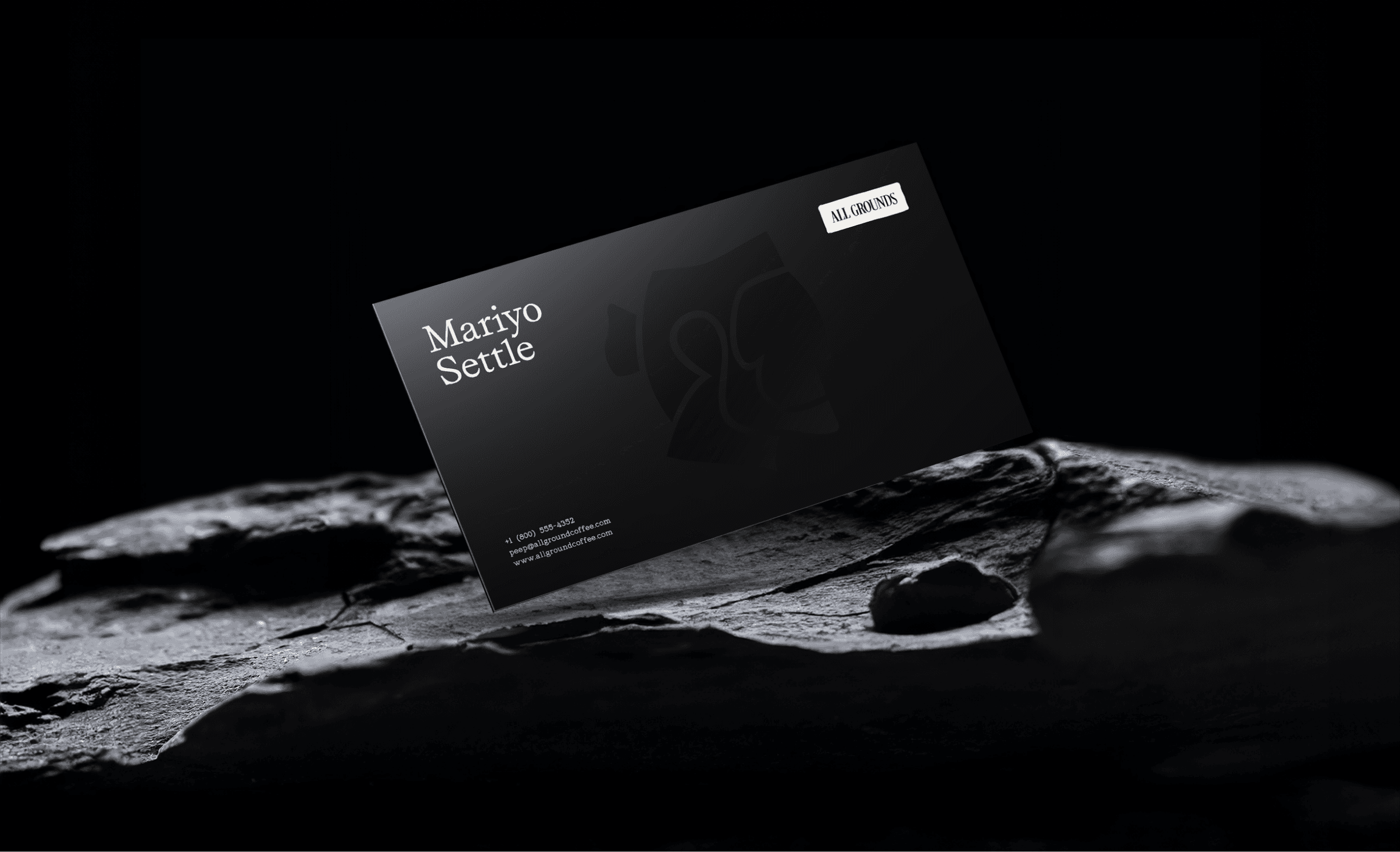
Brand Identity
The All Grounds visual identity was designed to embody the brand’s core pillars of cultural exploration, premium quality, and artisanal craftsmanship. The goal was to create a distinctive identity that would stand out in a crowded RTD coffee market while communicating the richness and authenticity behind every coffee origin.
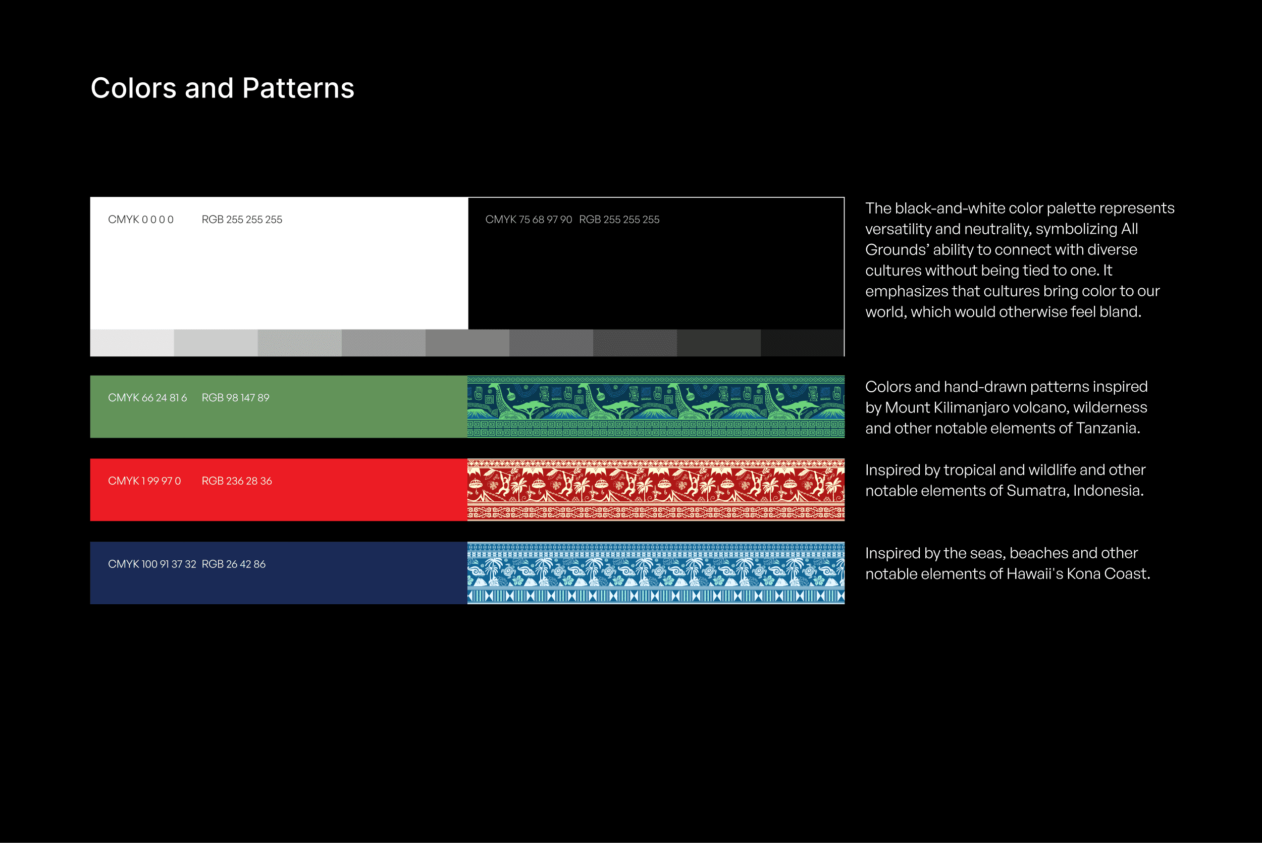
The process began with a comprehensive visual audit of competitors to understand category conventions, identify opportunities for differentiation, and establish a clear visual positioning. Using the Color DTO™ Wheel, we strategically selected a distinctive color palette that would create immediate shelf recognition while reinforcing the brand’s premium positioning.
Multiple mood boards and creative directions were explored to define the visual language that best captured the essence of All Grounds. Through iterative development and testing, we refined a direction that balanced sophistication with approachability—celebrating global cultures without compromising the premium nature of the product.
The resulting identity combines modern elegance with handcrafted character. Refined typography communicates quality and credibility, while custom hand-drawn patterns add warmth, authenticity, and a sense of cultural discovery. The color system draws inspiration from the diverse regions and cultures where the coffee is sourced, creating a rich and memorable visual experience. Together, these elements establish a cohesive identity that supports the brand’s storytelling and strengthens its shelf presence.
Scope of Work: Competitor Visual Audit, Mood Boards, Visual Positioning, Logo System, Typography System, Color System, Pattern System, Visual Identity Guidelines.
Packaging Design
The packaging for All Grounds was designed to reinforce the brand’s premium positioning while differentiating it from conventional RTD coffee products on the shelf. Every design decision—from the bottle structure to the smallest storytelling detail—was crafted to create a memorable experience that reflects the brand’s commitment to quality, craftsmanship, and cultural exploration.
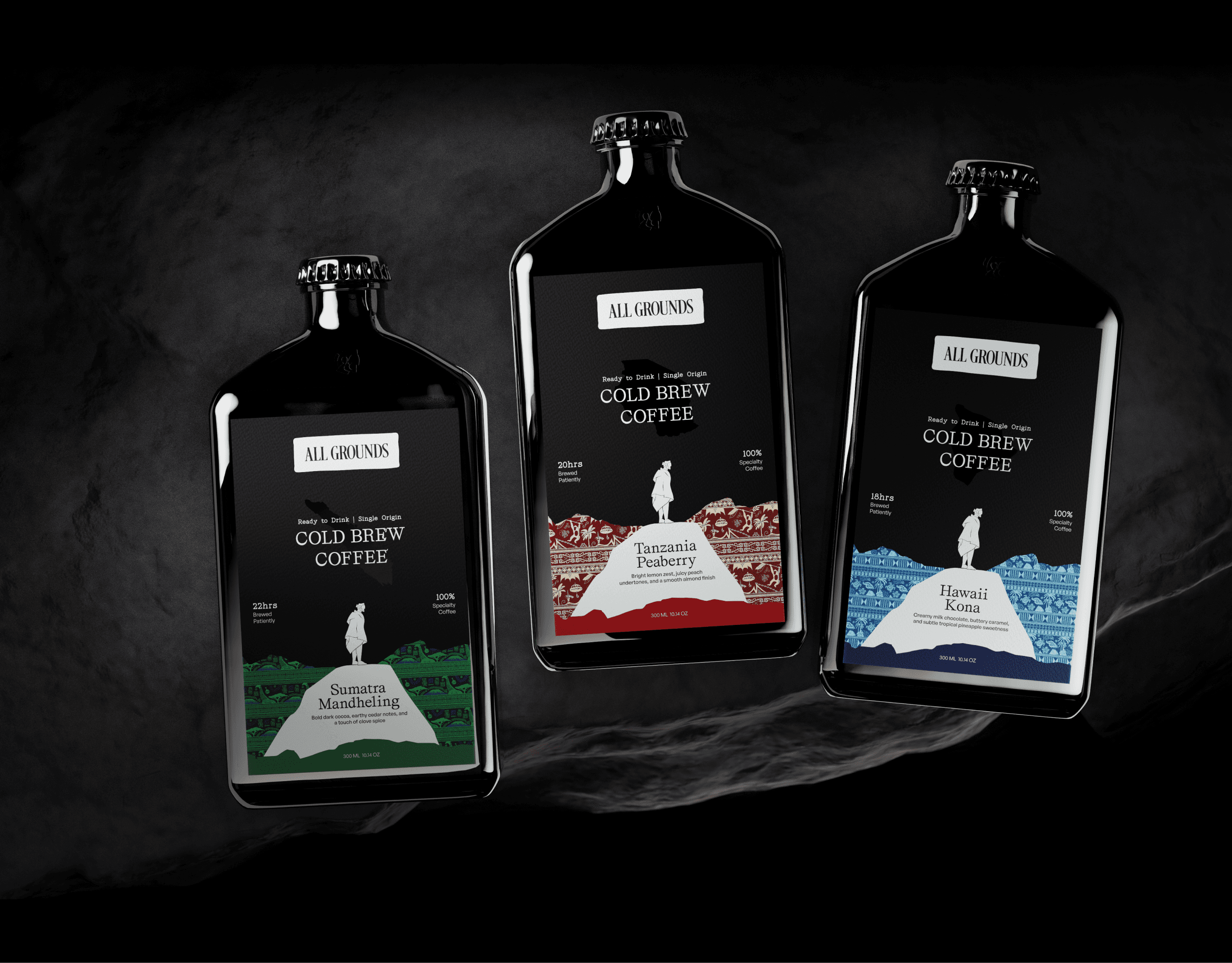
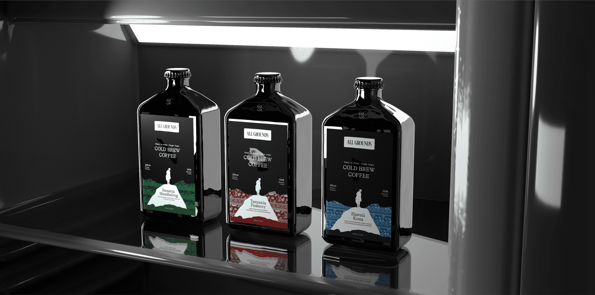
Bottle Design
A custom tinted glass bottle was selected to distinguish All Grounds from the cans and plastic bottles commonly found in the cold brew category. The unique silhouette immediately elevates the product’s shelf presence while reinforcing perceptions of quality, craftsmanship, and sustainability. The bottle itself becomes a key brand asset, helping communicate the premium nature of the product before consumers even engage with the label.
Label Design
The label system was designed to balance immediate product recognition with deeper storytelling.
The logo and product name are prominently displayed, ensuring consumers can quickly identify and understand the product.
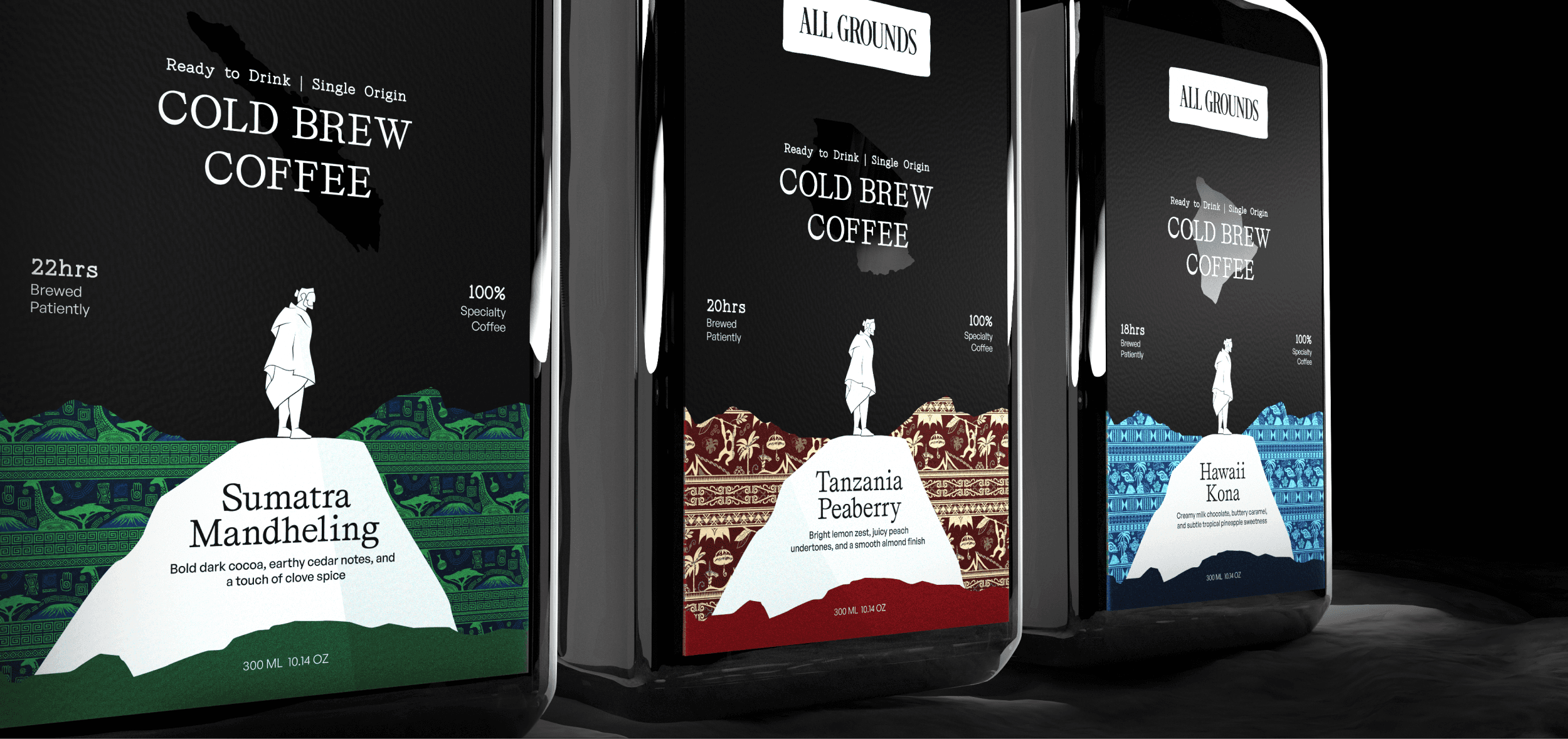
A central illustration depicts a traveler standing on the ground, surrounded by cultural patterns, flavor notes, and origin references. This visual metaphor represents the consumer’s journey through different coffee-growing regions and cultures around the world.
Supporting panels provide information about the coffee beans, their origin, and the brewing process, allowing consumers to discover the story behind each bottle.
Storytelling & Craftsmanship Details
To strengthen the connection between the coffee and its place of origin, the packaging incorporates multiple layers of storytelling and artisanal detail.
Custom hand-drawn patterns inspired by traditional cultural elements from each sourcing region—including Tanzania, Sumatra, and Hawaii—celebrate the heritage and uniqueness of every origin.
A glossy, reflective map element positioned behind the product name highlights the country of origin, creating a sophisticated visual cue that reinforces the brand’s global exploration theme.
A handwritten-style information block on the back label references the craftsmanship and care involved in producing each batch.
Detailed tasting notes, origin information, bean characteristics, and brewing details educate consumers while deepening their appreciation of the coffee’s journey from farm to bottle.
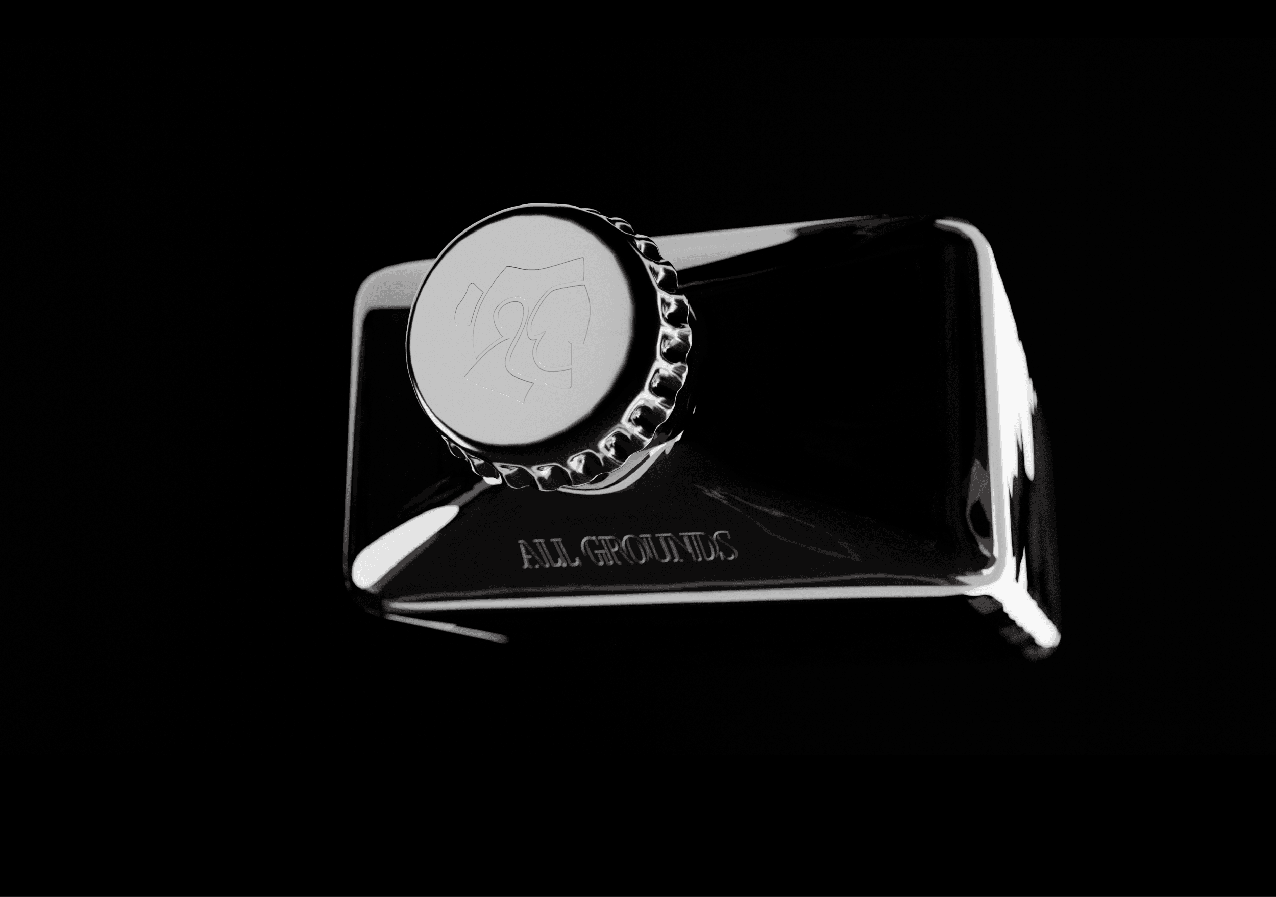
Embossed elements across the bottle, label, and cap create a tactile experience that enhances perceived quality and further elevates the brand’s premium identity.
Together, these design decisions transform the packaging into more than a container—it becomes a storytelling device that celebrates the people, places, and craftsmanship behind every coffee origin while creating a distinctive and memorable presence on the shelf.
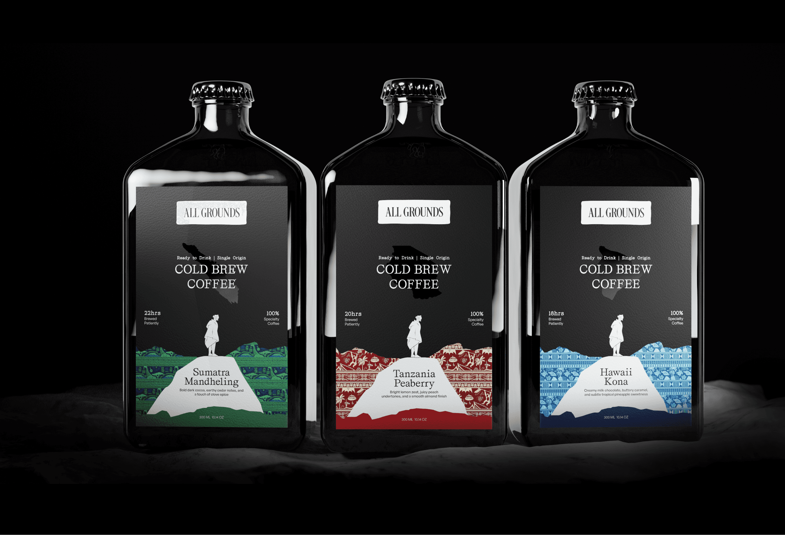
Man on the ground exploring different regions made of hand drawn patterns represents the audience's journey of coffee and culture.

Embossed marks on the front, back, and bottle cap
Reflective map of the bean’s origin placed behind the product name.
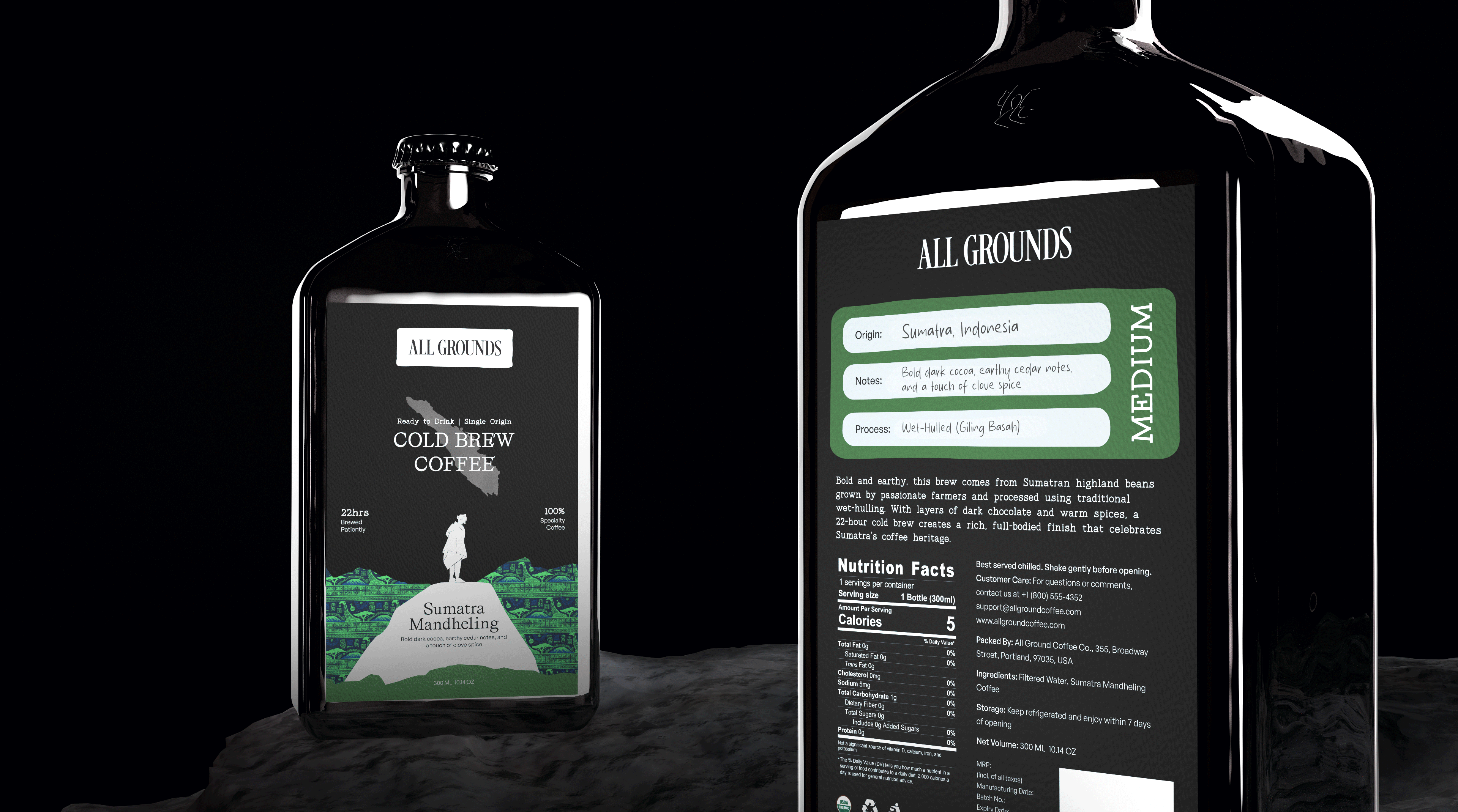
Coffee origin details styled as a handwritten note on the back.
More projects


