Scroll to explore

Overview
Industry
Beverage
Scope
Brand Strategy, Identity, Packaging design
Brand
Good Things - Flavored Mushroom Drink
Good Things
Making niche drinks popular to the masses
Good Things is a mushroom-based drink company that creates delicious, functional beverages for families. Each drink is crafted with specific mushrooms known to boost immunity, enhance cognitive function, and support athletic performance and recovery.
Challenge
Mushroom-based drinks are often met with skepticism, leading to low mass adoption. Consumers either associate them with an unpleasant taste or perceive them as too niche—either overly wellness-focused or excessively scientific. Many brands in the category reinforce this problem by positioning themselves within narrow wellness niches. Additionally, health-conscious consumers already trust fruit juices, making them hesitant to switch to an unfamiliar alternative.
Solution
We positioned Good Things at the intersection of familiarity and novelty, ensuring consumers would not feel intimidated or repelled by the product. While mushroom drinks are inherently novel, our strategy across naming, identity, flavor, design, language, and packaging focused on making the brand feel familiar. This approach bridged the gap between functional beverages and everyday fruit juices, making the category more approachable and acceptable to mainstream consumers.
To achieve this, we guided the business, product, and branding strategy around three key areas:
1. Flavor Strategy
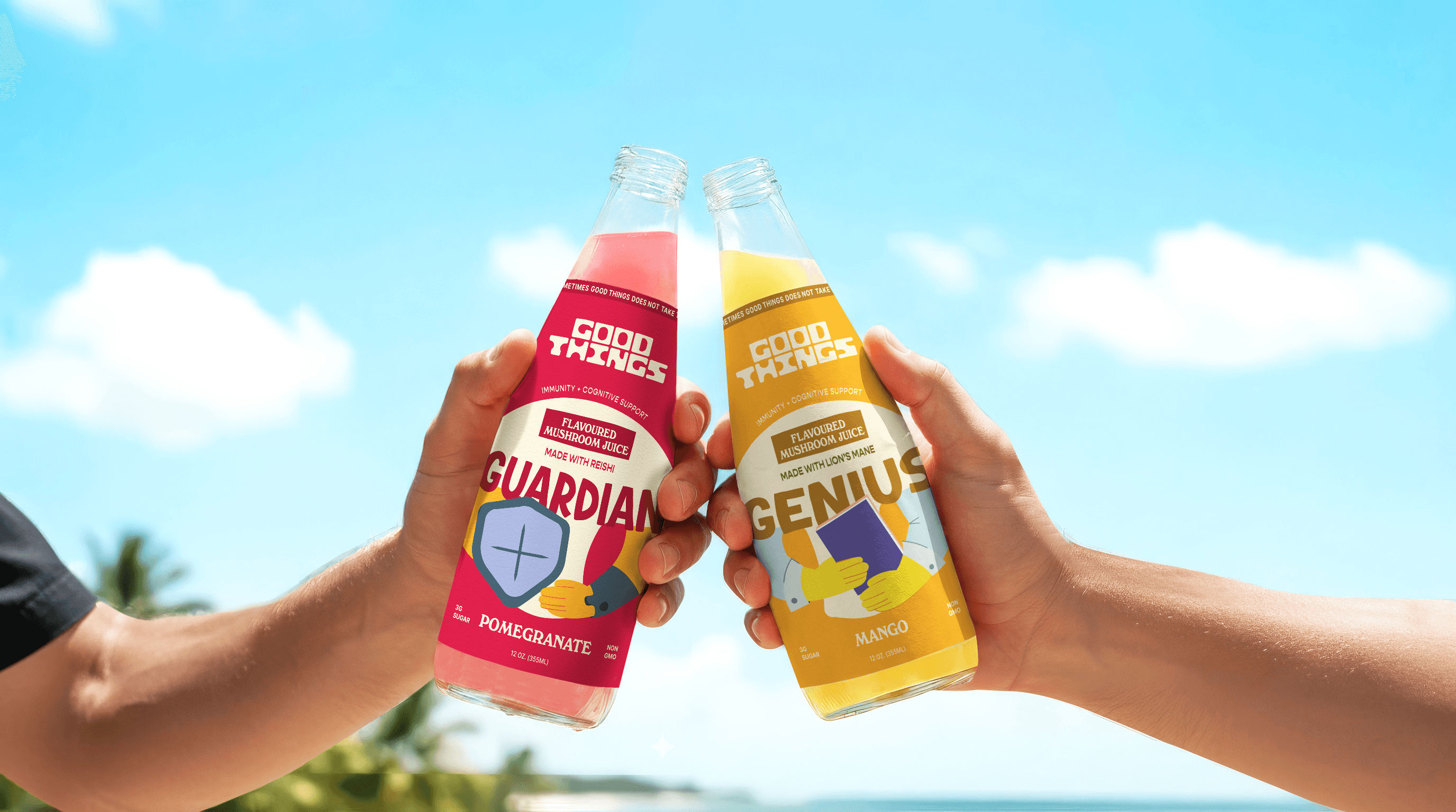
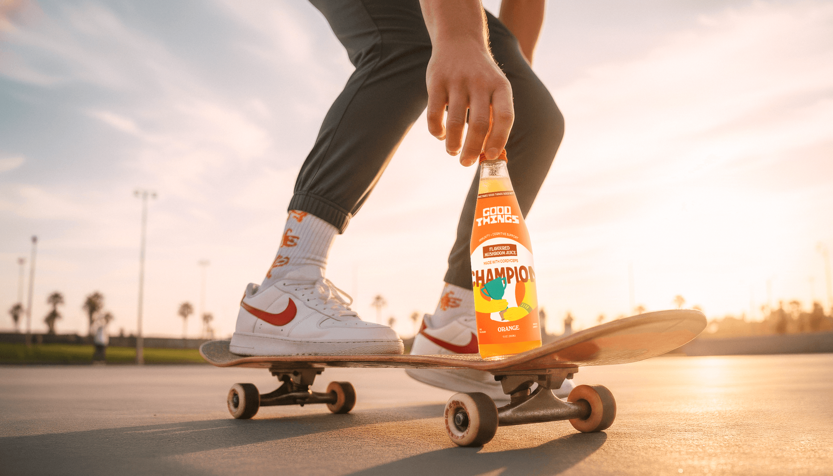
We paired functional mushrooms with universally loved fruits such as mango, orange, and pomegranate to create a familiar taste profile. This positioned the drinks as a natural extension of fruit juice rather than a medicinal supplement.
2. Product Formulation
Thick, earthy beverages can be off-putting. We guided the product formulation toward a juice-like consistency that delivered a clean, refreshing drinking experience without a lingering aftertaste.
3. Brand Strategy & Design
Messaging
We developed a friendly, fun, and jargon-free brand voice. Instead of overwhelming consumers with scientific claims or mystical storytelling, the communication focused on simplicity and accessibility.
Brand Naming
The name Good Things was strategically chosen to create positive associations from the first interaction. Rather than triggering reluctance through mushroom-centric naming, it immediately evokes optimism and familiarity. The name also opens opportunities for verbal branding, such as:
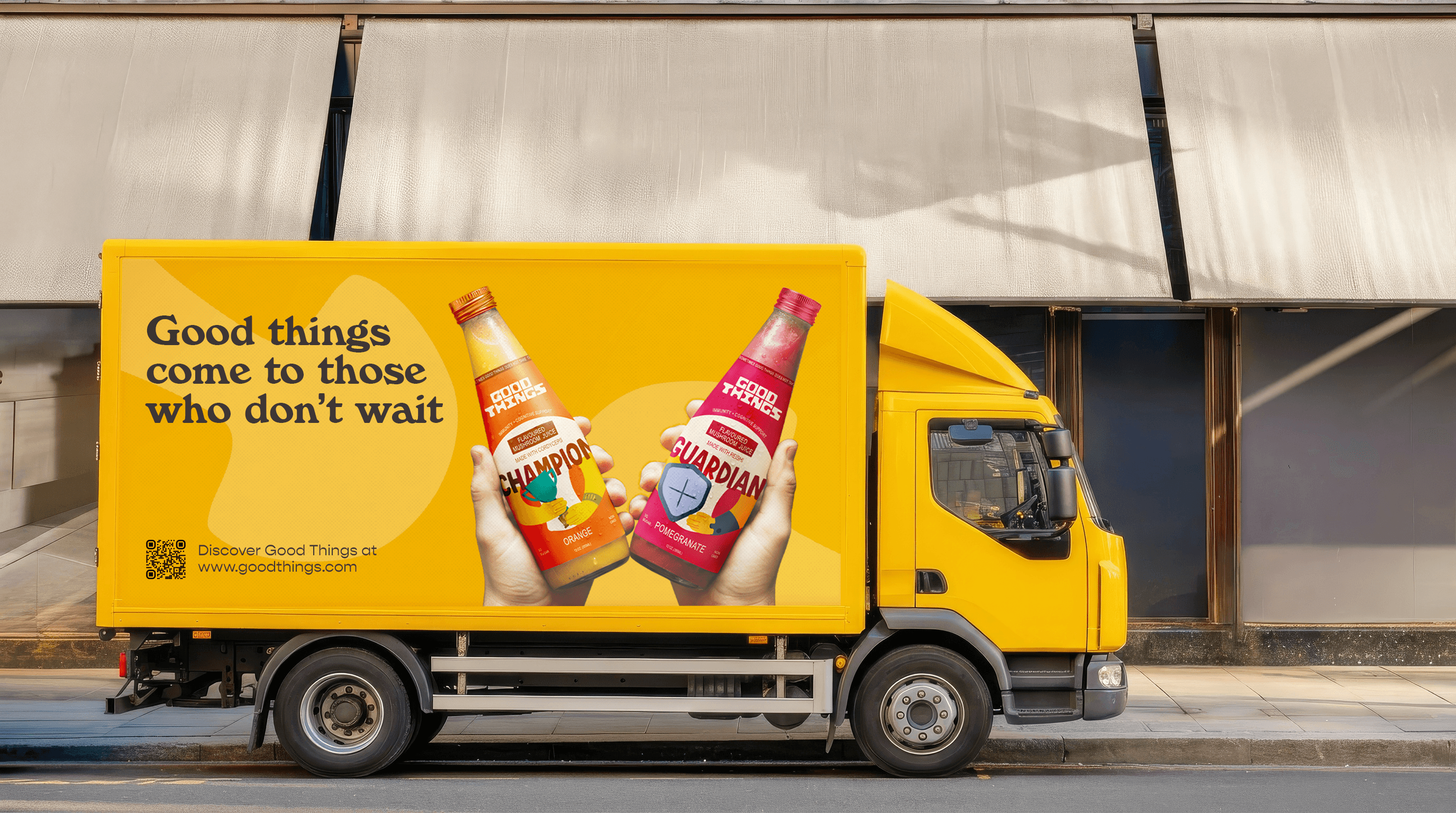
“Good Things come to those who don’t wait.”
“Good Things are best served chilled.”
Visual Identity
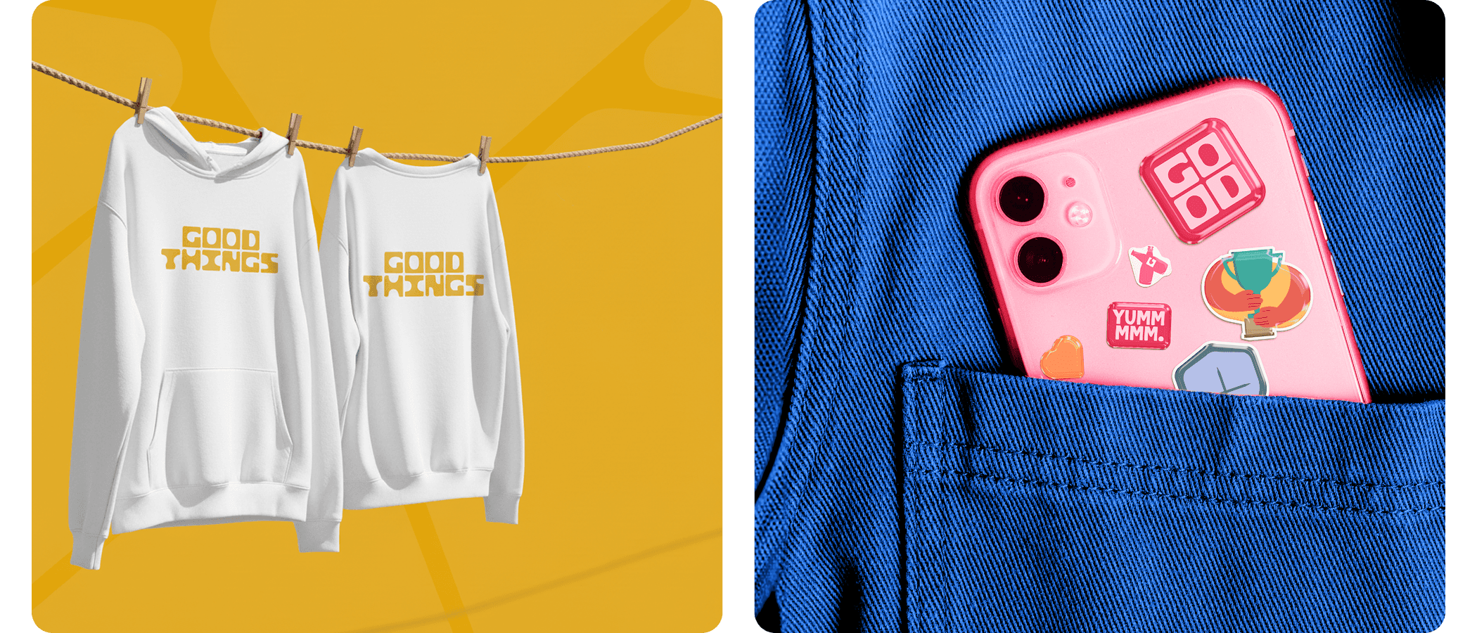
Bold, energetic colors create excitement and approachability, while premium-yet-friendly typography balances credibility with warmth. Illustrations and imagery reinforce the brand’s family-friendly character.
Packaging Design
Custom hand-drawn packaging creates strong shelf presence and makes the product difficult to overlook. More details about the packaging strategy and design direction are explored in the packaging section below.
Impact
By blending familiar elements—fruity flavors, lighthearted messaging, and approachable design—with the novelty of functional mushrooms, Good Things transforms a niche wellness product into an accessible everyday beverage. The result is a brand that reduces consumer hesitation and makes healthy choices feel easy, enjoyable, and approachable.

The Good Things logotype reflects the fundamental nature of mushrooms. Mushrooms serve as the building blocks of nature, sustaining life through their intricate underground networks. They are strong, interconnected, and essential to the ecosystem.
Inspired by this idea, the logo takes on a bold, block-like structure, symbolizing strength, unity, and stability—much like mushrooms support life, and Good Things supports daily nutrition and well-being. The stacked, grid-like arrangement reinforces this interconnected quality. Rounded apertures and counters, inspired by mushroom caps, add warmth and approachability, balancing playfulness with reliability. The subtle background pattern reflects the mycelial network, reinforcing the ideas of growth, connection, and vitality.

Good Things' identity features a bold, energetic, and fun color palette that feels both inviting and exciting. The primary color is a vibrant shade of yellow, symbolizing energy and positivity. The overall palette strikes a balance between natural and modern, aligning with health-conscious, family-oriented, and young consumers.
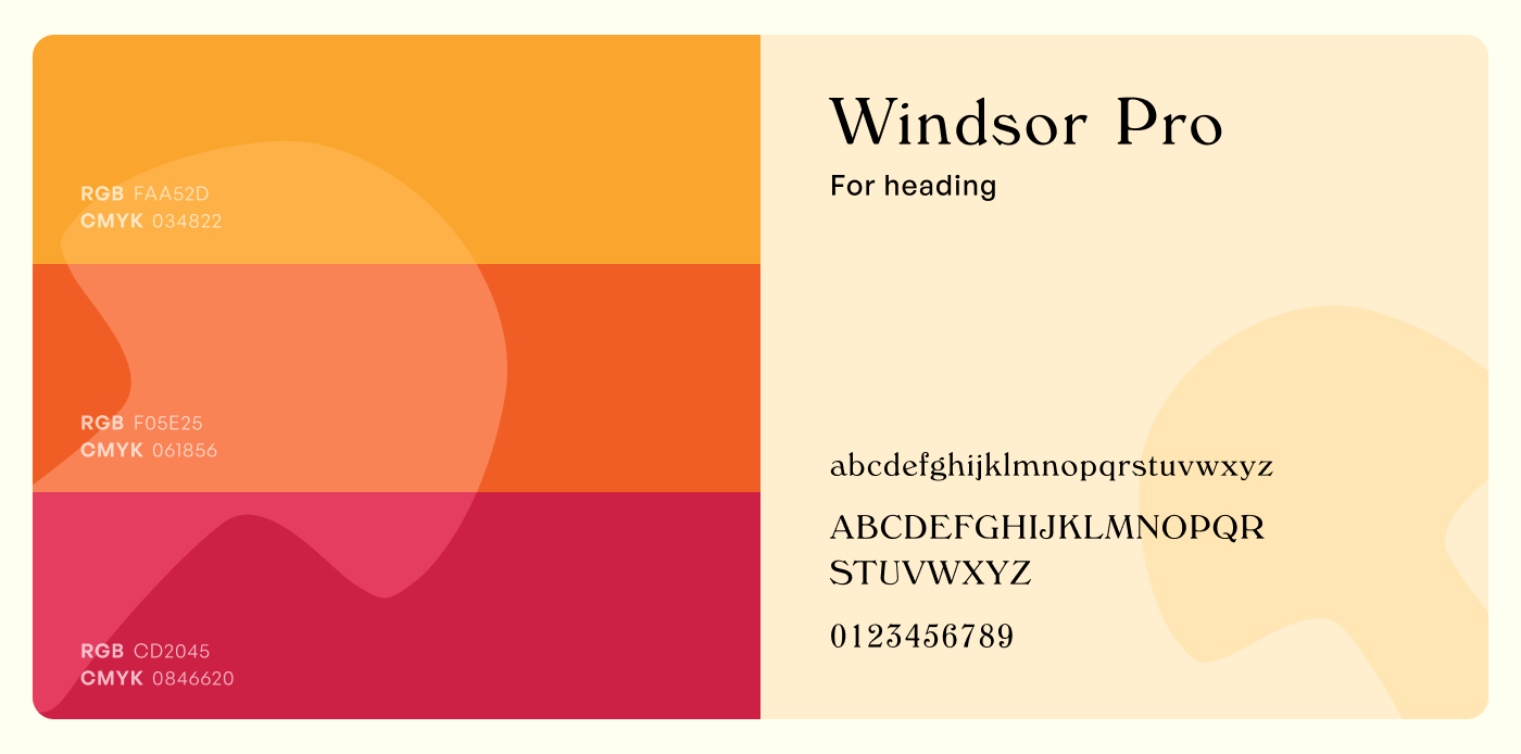
The font choices are carefully selected to reflect the brand's fun, and dynamic vibe. For headings, Windsor Pro is used—a bold, heavy, rounded serif with strong diagonal stress. It gives the brand a friendly and approachable feel, making it stand out with a unique and playful presence. For body text, Gopher, a reverse-contrast geometric sans serif, provides a modern, clean, and highly legible option. It adds a touch of sophistication while maintaining a distinctive look.
The contrast between the two fonts creates a well-balanced typography system, where Windsor Pro’s boldness in headings is complemented by Gopher’s clarity in body text, reinforcing the brand’s lively yet approachable personality.


Packaging Design
The Good Things packaging was designed to make mushroom-based drinks feel approachable and inviting. Since mushrooms are often perceived as an unusual ingredient for beverages, the packaging strategy focused on reducing hesitation through a playful, familiar, and welcoming visual experience.
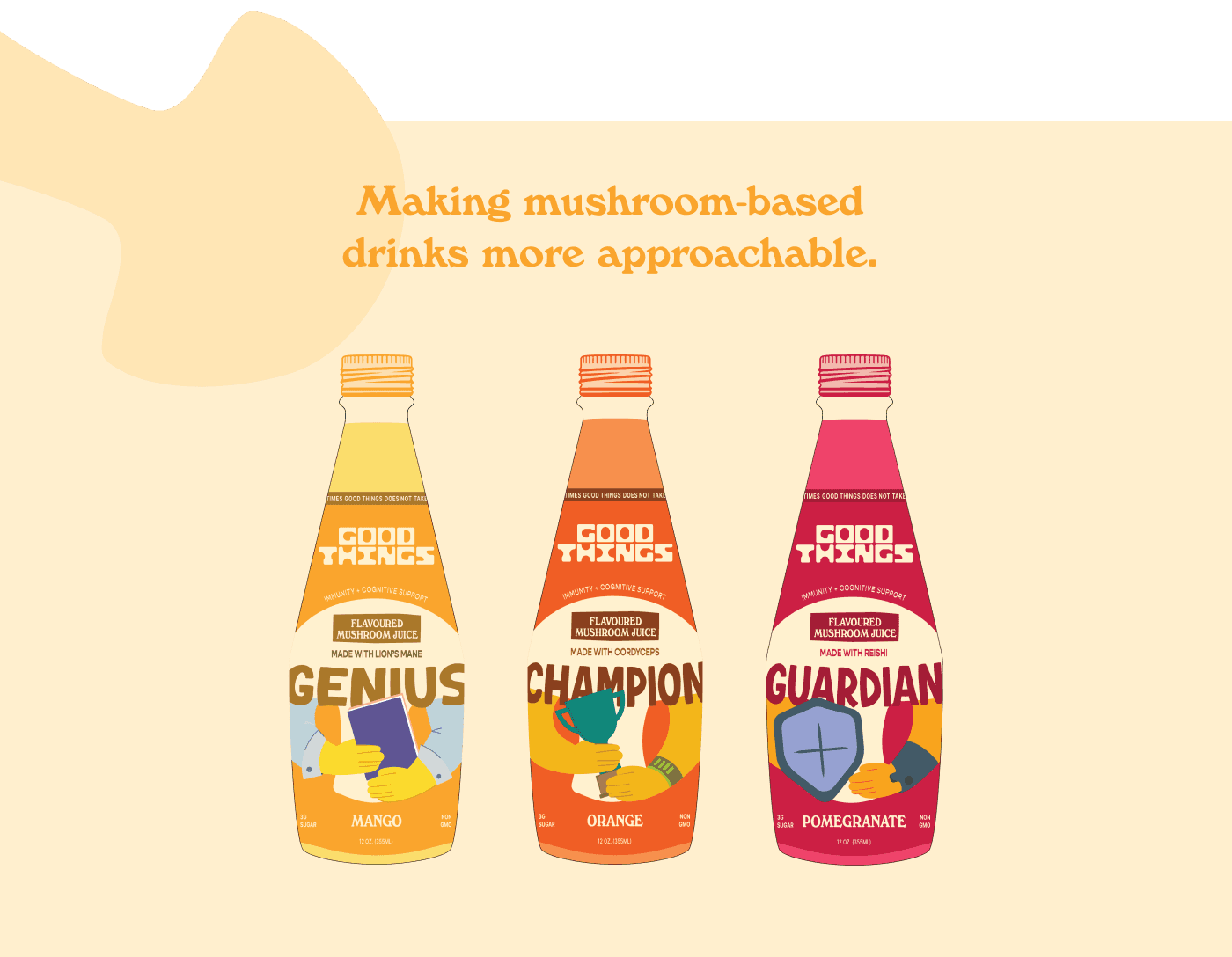
The front label incorporates a distinctive mushroom shape that communicates the product's key attributes at multiple viewing distances.
From a distance, the mushroom silhouette instantly signals that the beverage is mushroom-based, while the product name highlights its benefit-driven purpose.
At shelf distance, the design balances recognition and readability, allowing shoppers to quickly understand what the product is and why it exists.
Up close, the mushroom shape enhances the overall composition without interfering with product information, ensuring all key details remain clear and easy to read.
Color coding is used to reinforce each flavor variant, helping consumers quickly identify and differentiate products when displayed alongside other beverages.
By combining strong visual recognition with clear communication, the packaging creates immediate shelf impact while making a niche product category feel more familiar and accessible to mainstream consumers.
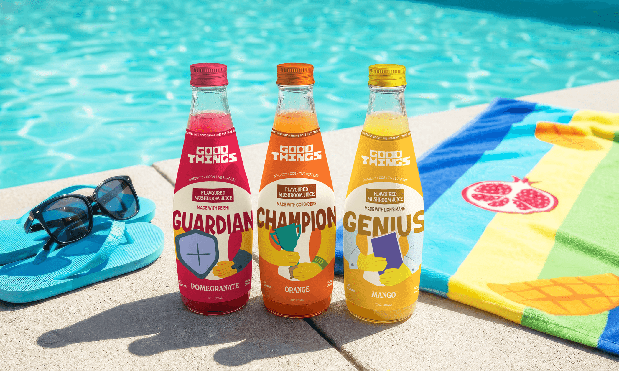

Each label for 'Good Things' features custom hand-drawn illustrations of the product name, a mushroom, a hand, and the object the hand is holding, all representing cues of the benefits. These playful illustrations work together to visually communicate the product’s benefits in a lighthearted and approachable way.

More projects
