Scroll to explore

Overview
Industry
Organic
Scope
Packaging Design System
Brand
Organigram
Overview
Organigram, a certified organic food company specializing in APEDA-certified pulses, grains, and spices, partnered with Rezon Studio to redesign its packaging for both retail shelves and online marketplaces. Building on the brand strategy and visual identity we had previously developed, the objective was to create a packaging system that clearly communicates product quality, strengthens brand recognition, and stands out in a highly competitive category.
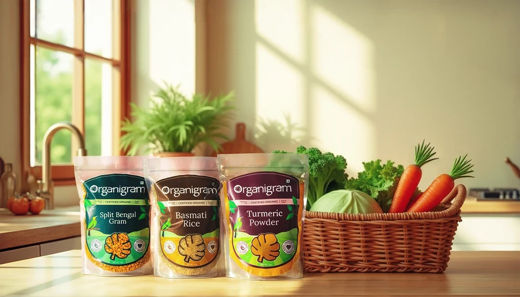
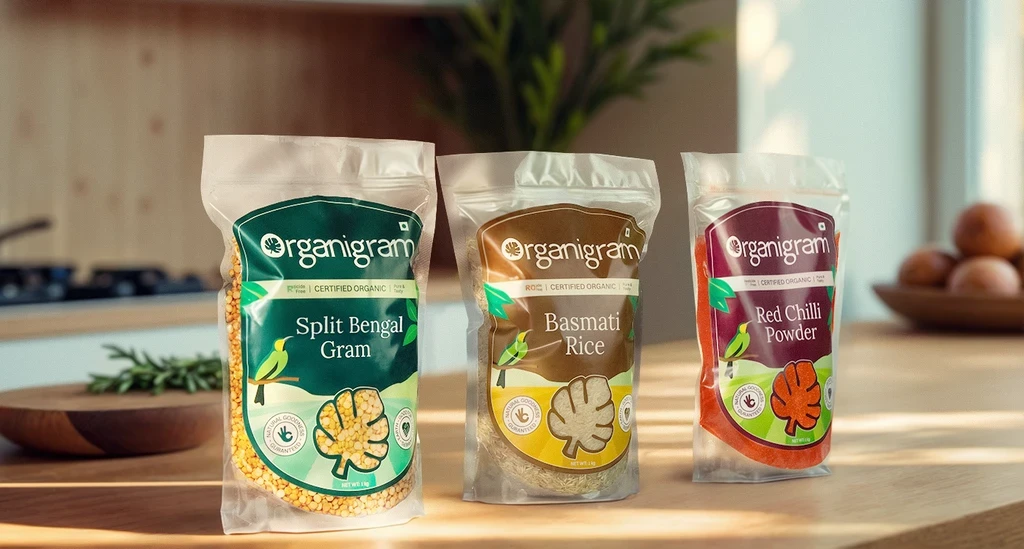
To inform the design direction, we conducted competitor research and category analysis to understand prevailing packaging conventions and identify opportunities for differentiation. One key insight was that consumers often rely on visual cues to assess quality when purchasing staple food products. To leverage this behavior, we chose a transparent packaging approach that allows customers to instantly see the freshness, texture, and quality of the product inside.
Given Organigram’s diverse product portfolio spanning Pulses, Grains, and Spices, we developed a clear and scalable packaging architecture that could accommodate a growing range of SKUs while maintaining consistency across the brand.
A three-color categorization system was introduced to help consumers easily navigate the product range:
Green for Pulses
Yellow for Grains
Magenta for Spices & Others
These colors were carefully selected to complement the natural appearance of the products while creating strong shelf distinction between categories.
To support future growth, we designed three packaging size variations for each category and created a flexible naming system capable of accommodating both short and long product names without compromising visual consistency.
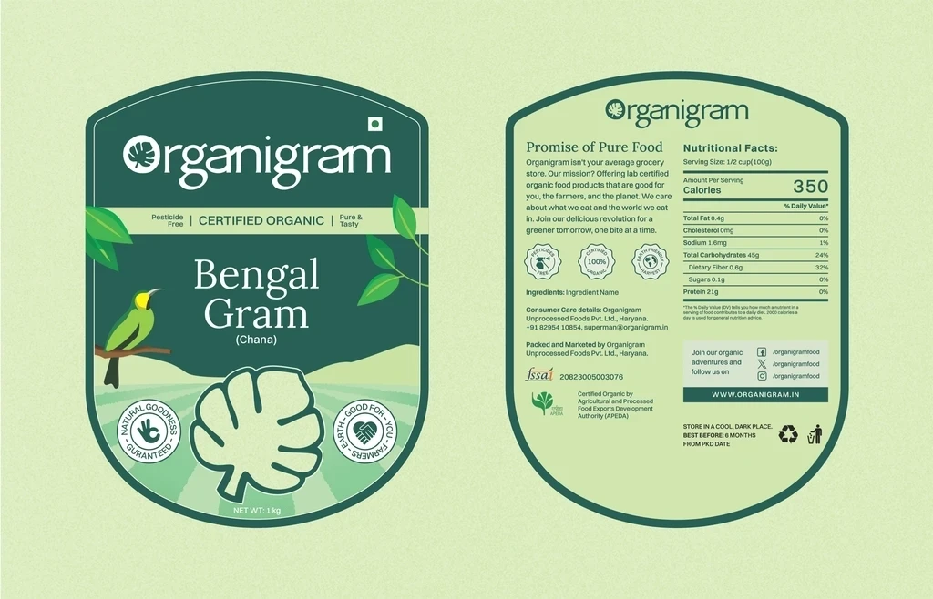
The packaging features a custom bird illustration set against a farm landscape, reinforcing the brand’s commitment to nature, purity, and organic farming. Supporting brand elements such as the tagline “Natural Goodness, Guaranteed” and the “Good for You” badge further strengthen the brand’s organic positioning and consumer trust.
A transparent treatment within the logo allows the product itself to become part of the design, while a dedicated information strip highlights key product claims such as Certified Organic, Pesticide-Free, and Pure & Tasty, ensuring important benefits are communicated at a glance.
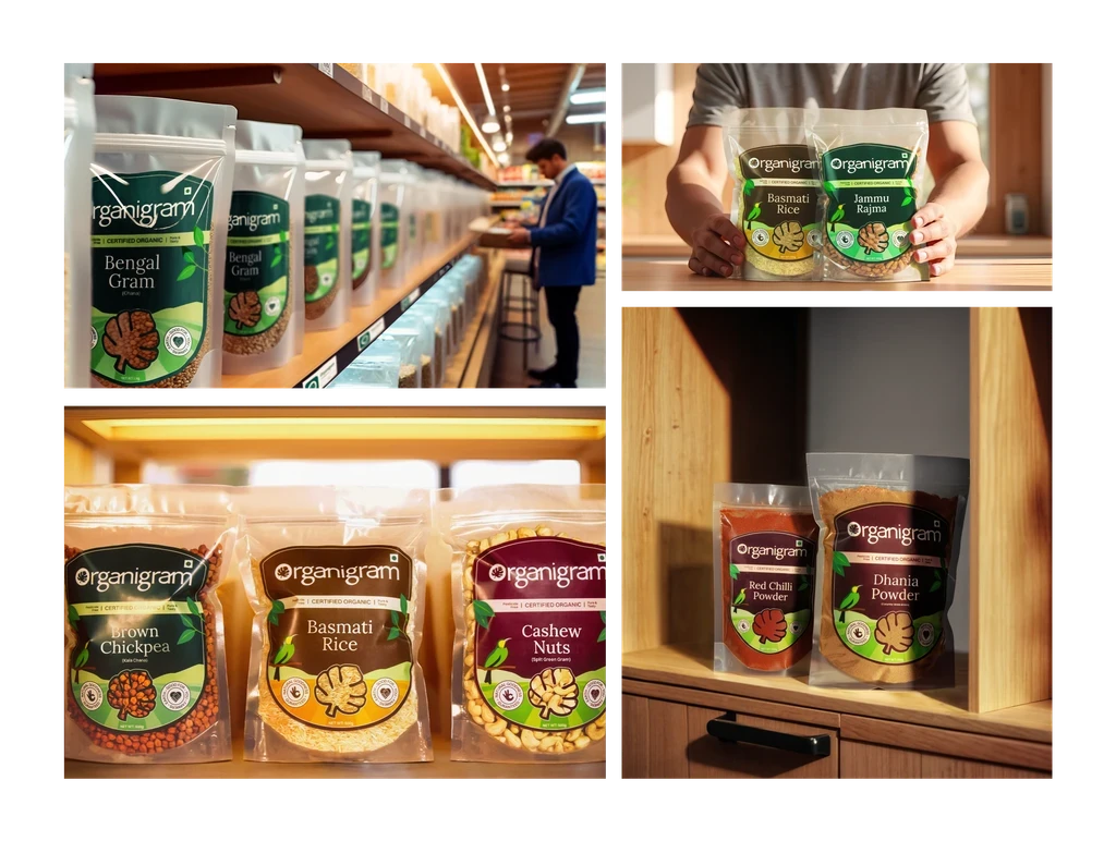
The result is a cohesive packaging system that performs effectively across both physical retail environments and digital storefronts, helping Organigram communicate quality, improve product discoverability, and maintain consistency across 42 SKUs while supporting the brand’s continued growth.
Developed a three-color packaging design system: green for pulses, yellow for grains, and magenta for spices and others, which complements the natural textures and colors of the products.
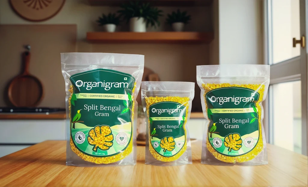
Developed three size variations based on weight for each category and a flexible naming system to accommodate both large and small product names.
More projects


